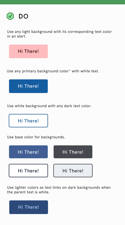
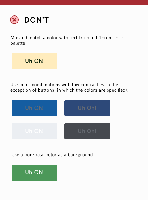
Colors should be used purposefully to communicate how things should be used in the interface. Colors should be consistent so products may be easily interactable and predicatable. These colors are for Hack4Impact, but you may change the base colors to fit your products styling and branding.
Base Colors
Base colors are the primary branding colors. For bridge, it's Hack4Impact's blue, indigo and grey. The middle shade in each palette is the primary color.
Secondary Colors
Secondary colors are for actions or states. Green is for success. Red is for error. Yellow is for warning. The middle shade in each palette is the primary color.
Typography
Color Pairs
Top color indicates a color that can be used for main text. Bottom color is used for supporting text.
Usage

